Dflip Posted August 16, 2004 Share Posted August 16, 2004 I was switching between sites when all of sudden things went black and white. The new look for Klipsch is here. The same black is on www.klipsch.com. It is more forceful and I guess for lack of a better word, hip. The product info section looks like it might be more user friendly. It has gotten worse over the last month or so, and an improvement was necessary. Any comments? Quote Link to comment Share on other sites More sharing options...
jt1stcav Posted August 16, 2004 Share Posted August 16, 2004 It's okay, I guess. I kinda like the old style better, but I'll check this new design out more thoroughly later on. I don't mind the dark borders on the Forum pages, but the black type is nearly impossible to see...make it white for cryin' out loud! Just looked through my System Profile, and all the words are white...WTF? You can't hardly read it on the light grey background! That sucks! Sometimes things should be left well alone, ya know what I mean? If it ain't broke, don't fix it (like I have to now with the white letters in my profile)! Quote Link to comment Share on other sites More sharing options...
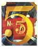
Daddy Dee Posted August 16, 2004 Share Posted August 16, 2004 Looks sharp to me. What is the speaker on the main page? Quote Link to comment Share on other sites More sharing options...
colterphoto1 Posted August 17, 2004 Share Posted August 17, 2004 I think the look is quite bold, but the scroll bar is difficult to make out. Also white text on black or gray background should be either bold or a larger font type. It is definitely less legible. Quote Link to comment Share on other sites More sharing options...
picky Posted August 17, 2004 Share Posted August 17, 2004 I like the new look. It was time for a change. I'm on a diet and I got tired of seeing that kid and the guy eating ice cream! Quote Link to comment Share on other sites More sharing options...
dantfmly Posted August 17, 2004 Share Posted August 17, 2004 i like the new look. Not much for all black back ground, but it does look nice, and i like the product pages a lot better. much better pictures of products Quote Link to comment Share on other sites More sharing options...
MD1032 Posted August 17, 2004 Share Posted August 17, 2004 I think it's OK. Definitely more modern, slick-looking. Quote Link to comment Share on other sites More sharing options...
neo33 Posted August 17, 2004 Share Posted August 17, 2004 Somebody should fix the font color! I can't see the page number. Same thing for the FAQ. Black on black or white on white don't work very well! Really! Quote Link to comment Share on other sites More sharing options...
ZAKO Posted August 17, 2004 Share Posted August 17, 2004 NEO....Dont yell you,l bust your tweeter. Quote Link to comment Share on other sites More sharing options...
edwinr Posted August 17, 2004 Share Posted August 17, 2004 What happened to the Jubilee? It was there in the product lineup, now it's gone. Quote Link to comment Share on other sites More sharing options...
Dale W Posted August 17, 2004 Share Posted August 17, 2004 Add a bit more colour and we'll look just like the AVS forum . lol Klipsch will keep changeing and adding to the page , making it better all the time. I think it would be " REAL " cool to see some manufacturing pictures on the site , kinda like a online tour of the heritage plant !!!!!! be neet to see the plant and speakers in different stages of manufacture . Quote Link to comment Share on other sites More sharing options...
jt1stcav Posted August 17, 2004 Share Posted August 17, 2004 I just wanna know why my System Profile's lettering is white on the light grey background? It was black before the change...now it's barely readable! Quote Link to comment Share on other sites More sharing options...
ableal Posted August 18, 2004 Share Posted August 18, 2004 I like the new site and i can't wait to see the new reference lineup. i am a freak for multi driver loudspeakers Quote Link to comment Share on other sites More sharing options...
Moderators Amy Posted August 18, 2004 Moderators Share Posted August 18, 2004 Yes, we will continue to update and improve the site, including the colors! It's only been up a day!! Quote Link to comment Share on other sites More sharing options...
jt1stcav Posted August 18, 2004 Share Posted August 18, 2004 Thank you, Amy...my Profile's been restored. I appreciate it! Quote Link to comment Share on other sites More sharing options...
3dzapper Posted August 19, 2004 Share Posted August 19, 2004 ---------------- On 8/18/2004 11:08:26 AM Amy Unger wrote: Yes, we will continue to update and improve the site, including the colors! It's only been up a day!! ---------------- Amy, I'm sorry to say that I think that this combo is terrible. I went to "The Garage", it is virtually unreadable and very eye straining. Neo is correct in ranting above. Black can be Chic, just not in it's current incarnation. Rick Quote Link to comment Share on other sites More sharing options...
LarryC Posted August 19, 2004 Share Posted August 19, 2004 I think it just looks too stark on the forum, like we're behind prison bars. On the Klipsch website, the black nicely sets off the copper color on the one hand, but looks too satanic for me with deep red and gray text on the other. I like cheerier colors, myself. Quote Link to comment Share on other sites More sharing options...
Dflip Posted August 19, 2004 Author Share Posted August 19, 2004 The gray text needs to be lightened up a tone or two to make it more readible against the background. There is not enough contrast at the moment. The downside of light text is when you copy it into Word, the colour must be changed in order to be seen. There is a compromise between readibility and style and the current look may be a touch to stylish and has missed the other part, customers must be able to read what is written on the screen. Quote Link to comment Share on other sites More sharing options...

Recommended Posts
Join the conversation
You can post now and register later. If you have an account, sign in now to post with your account.
Note: Your post will require moderator approval before it will be visible.